Case Study:
Flowers
Dedicated Mobile App
Project Overview
The Product
The Flowers app is an American floral arrangement and delivery service. Flowers will let users place orders for upscale bouquets in a simple and straightforward way. Flowers targets customers who are busy professionals who don’t want to waste their free time buying flowers.
My Role
UX designer designing the app for Flowers from conception to delivery.
The Problem
Busy professionals need a simple and straightforward way to order flowers.
Responsiblities
Conducting interviews, paper and digital wireframing, low and high-fidelity prototyping, conducting usability studies, accounting for accessibility, and iterating on designs.
The Goal
Design an app that allows users to quickly order flowers without wasting their free time.
Project Duration
October 2022 to January 2023
Understanding the User
User Research
I created empathy maps and personas to under the users I’m designing for their needs. Busy professionals who don’t want to waste their free time ordering flowers for the office or friends and family are a primary user group identified through research.
This user group confirmed initial assumptions about Flowers customers, but research also reveal that free time was not the only concern. Other problems included the app being accessible for screen readers and other languages.
Pain Points
Busy professionals are too busy to spend their free time on ordering flowers.
Many platforms are not optimized for assistive technologies.
Platforms are not accessible to non-native English speakers.
Persona 1: Anna
Problem statement:
Miriam works in HR for an English company in Madrid who wants to quickly find a doctor near her that speaks English so that she can stop wasting time and be part of her own treatment.


User Journey Map
Mapping Anna’s user journey demonstrated how useful an app to deliver upscale flower arrangements would be.
Starting the Design
Ideation
Drawing out several draft iterations on paper ensured that I was able to consider a variety of options to address user pain points quickly and without wasting resources. For the homepage, I prioritized quick, popular suggestions.
2_edited_edited.png)


Digital Wireframes
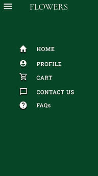
For the initial digital wireframe, I was able to recreate a clean version of the paper wireframe. A simple menu with all the essentials was important to the user group.
The option makes finding a bouquet for a specific event quick and easy.

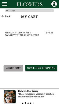
This feature lets users see the trending bouquets and reviews from past customers with real pictures.
Allows quick access to navigate the app.

Usability Study
I conducted an unmoderated usability study with 5 participants using a low-fidelity prototype.
Findings
Round 1
Users want clarification on the delivery date selection page.
Users found the checkout process to be intuitive.
Users what a more functional prototype.
Round 2
There was a bug with the interactions on the homepage.
Price of shipping was too expensive.
Users suggested FAQs page and delivery information.
Redefining the Design
Mockups
The early designs were functional, but needed clarification on the delivery date page. After the usability studies, I added black out dates for past days and highlighted the selected date. As well as simpler call to action buttons.
Before Usability Study

After Usability Study

Mockups
The first usability study demonstrated some users were more drawn to other sections on the page more. So the page was order was tweaked and adding pictures of real bouquets and color brought the mockups to life.
Before Usability Study

After Usability Study

Before Usability Study

After Usability Study


Redefined Designs
Additional mockups from the dedicated mobile app.


High-Fidelity Prototype
The high-fidelity prototype followed the same user flow as the previous prototype.

Accessibility Considerations
Used icons to make navigation easier.
Used color combinations that are simple, calm, and of an appropriate contrast.
Going Forward
Takeaways
Impact:
The app makes users feel like they can quickly order a high-end bouquet without a confusing checkout process.
One quote from a usability study participant:
“All in all, I think the app is very intuitive and easy to use.”
What I learned:
During this process, I realized that your initial assumptions and ideas will evolve throughout the process. Especially with the input of study participants the prototypes became even more user oriented each time.
Next Steps
Conduct more user research to gather more feedback.
Create more wireframes and expand the app functions based the basic options that exist now.
Conduct more usability studies to see if the app is still meeting the needs of users.